Essie’s Cutouts font
I made this font for the text of my ‘Ambulant’ zine, and I like it, so I thought I’d share it.
I wanted it to look as motley and hand-cut as possible so I kept the curves and angles slightly imperfect.
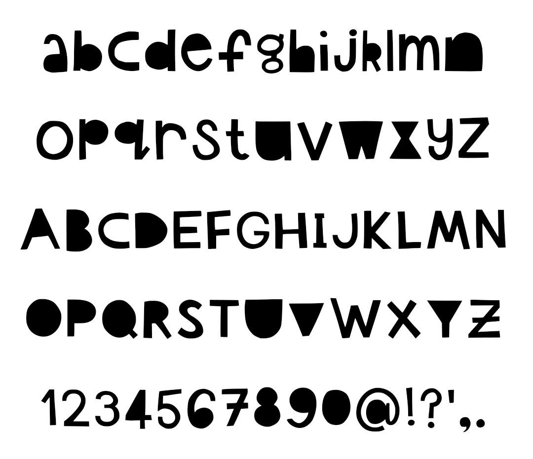
I also made the upper and lower case letters the same size so that if you mix them up you have two versions of each letter to work with to make your text look more varied and random:
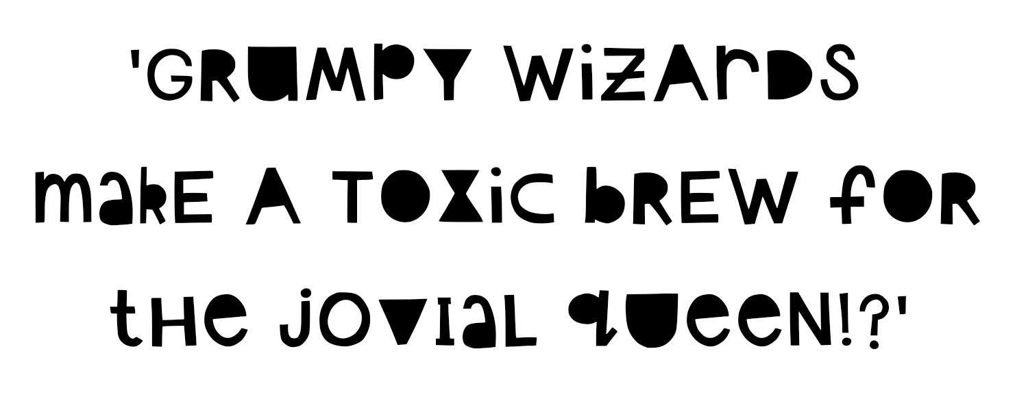
The random letter mixing is what I did for ‘Ambulant’ and I think it made the whole thing look pleasingly handmade with just the right amount of haphazardness.

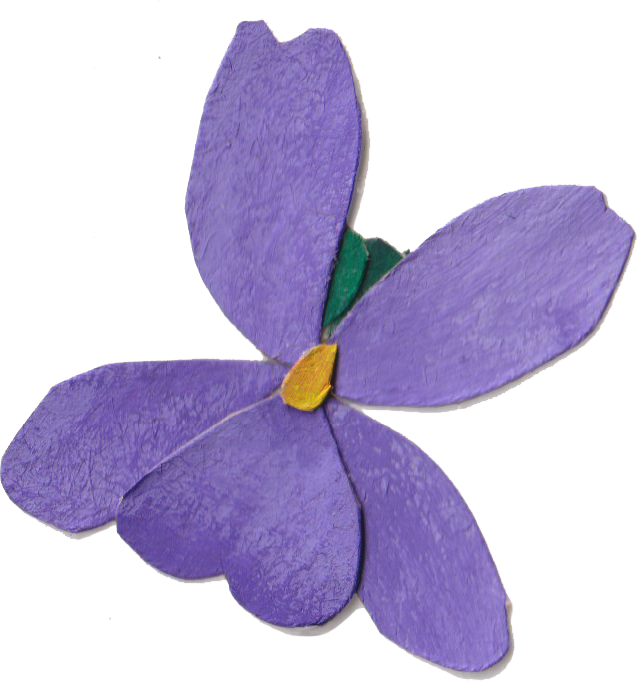
The solid letters are a great base to use as a clipping mask because there’s lots of space for texture and colour to show. I’ve done that with a painted texture from one of my collage papers, and it looks nice and painterly while maintaining nice crisp edges for legibility:

If you’d like to use it you can find the TTF file here, and the OTF file here. They are free to download for personal use, but if you would like to leave a tip as a gesture that’s hugely appreciated, and you can do that here.
Enjoy!